Dare To be Different
Saturday, April 14, 2018
Final Project!
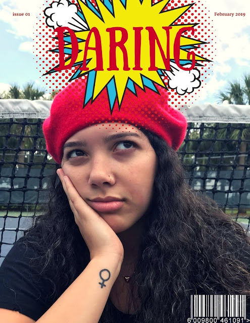
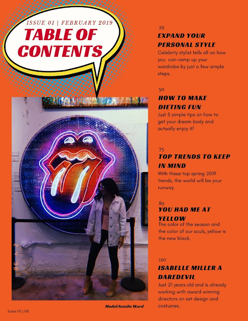
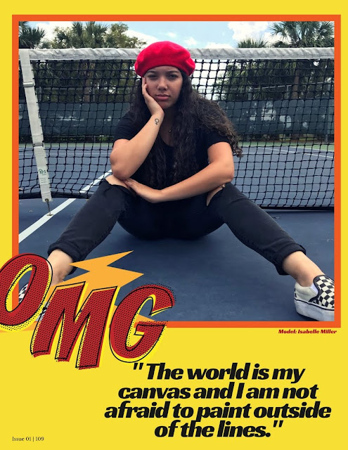
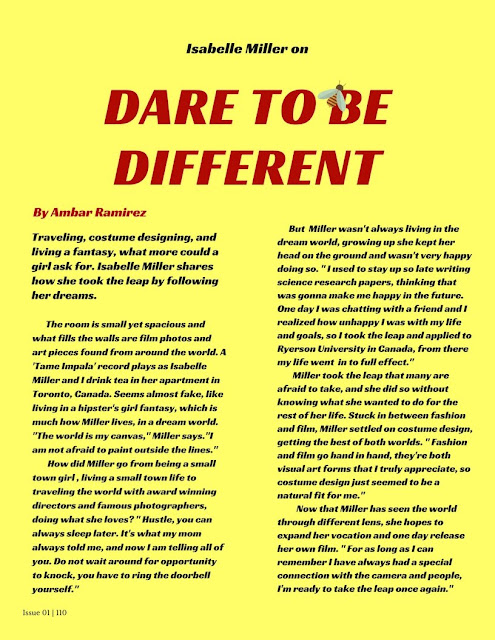
Here is my final project, Daring magazine!-
Click HERE.
Or
https://www.canva.com/design/DACzuqJ1QzE/GycxFY_KlgYoukunB6PDVw/view?utm_content=DACzuqJ1QzE&utm_campaign=designshare&utm_medium=link&utm_source=sharebutton
Click HERE.
Or
https://www.canva.com/design/DACzuqJ1QzE/GycxFY_KlgYoukunB6PDVw/view?utm_content=DACzuqJ1QzE&utm_campaign=designshare&utm_medium=link&utm_source=sharebutton


Sunday, April 8, 2018
Sneak Peak
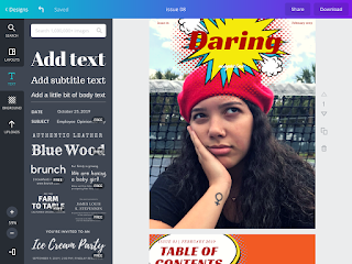
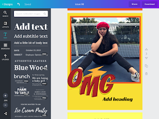
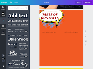
So with my photos and all, I just have some trouble with deciding the fonts and how I am going to lay out the table of contents, but I am really happy with the colors I have chosen. Like I said in all my previous posts, I wanted this magazine to embody different. So every page is a different shade of warm tones, plus yellow is such a bright color that catches people’s attention in a positive way. As well as the little add ons of the comic effect or icons, embody being different and daring! Here are some sneak pics!


Saturday, April 7, 2018
The Photoshoot
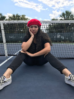
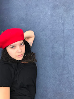
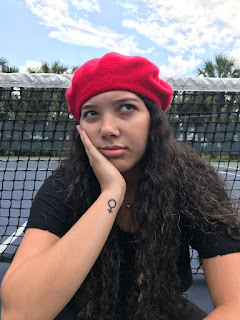
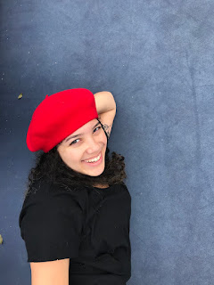
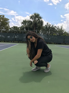
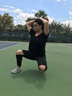
I finally got images for my magazine! After school I headed to a tennis court with Isabelle Miller. I decided to change the scenery for I thought a tennis court had a lot of open space, where the readers could focus on the model and her emotions rather than a distracting backdrop. So here are some images in which I am still deciding which I am including!


Something I Came Across
I was on youtube the other day and I randomly came across this video of a girl who recreated older vogue covers, and I mean like covers from the 30s to the 90s. Not only was it a cool video overall, but the video also had some research on it pertaining to why these covers were the way they were!
Thought this video was really helpful in showing me how fashion magazines range in style, even if it has been the same publication for over a decade. Also showed me the importance of mise-en-scene, in showing a time period or message.
Sunday, April 1, 2018
So Far So Good
Alright so I played around a little bit on Canva, working on the front cover.
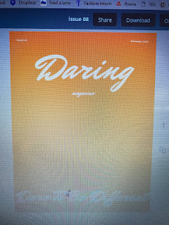
Obviously looks a little bit bland, but I'm thinking on leaving the focus on the subject. I still have to play around with the fonts to see what works best, but at the moment this font isn't too bad. Also if you can see the little bee on the letter "B" at the bottom, I think is a simple yet important piece.
I can imagine it with the outside scenery I am going for, super excited!
Joomag Vs. Canva
Like I said in my last post I am going to start working on my layout until I can take photos. So once I get my photos done, I can just insert the images and be done!
But I am trying to figure out which website is going to allow me to create my layout correctly and efficiently.
My two options are Joomag which looks like it might be more difficult to navigate and Canva in which I am comfortable using.

This is an example of the creating process through Joomag. As you can see from the image, it is a bit intimidating and confusing to be honest.

This is an example of the creating process through Canva. As we can see, it is a bit more familiar and organized. They also provide templates and it is just easier to navigate from what I can see versus Joomag.
I am still gonna attempt both and see which one creates my product the best, but I am leaning more towards Canva.
But I am trying to figure out which website is going to allow me to create my layout correctly and efficiently.
My two options are Joomag which looks like it might be more difficult to navigate and Canva in which I am comfortable using.

This is an example of the creating process through Joomag. As you can see from the image, it is a bit intimidating and confusing to be honest.
This is an example of the creating process through Canva. As we can see, it is a bit more familiar and organized. They also provide templates and it is just easier to navigate from what I can see versus Joomag.
I am still gonna attempt both and see which one creates my product the best, but I am leaning more towards Canva.
Subscribe to:
Comments (Atom)
My CCR
Here it is, my creative critical reflection - https://voicethread.com/share/10701329/
-
I was on youtube the other day and I randomly came across this video of a girl who recreated older vogue covers, and I mean like covers ...
-
Here it is, my creative critical reflection - https://voicethread.com/share/10701329/
-
Hey there amigos! So today I wanted to think about my two page spread. As said in my blog post concerning my front cover, I mentioned ...
