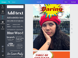
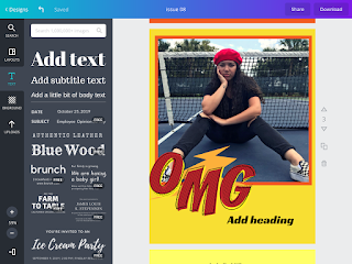
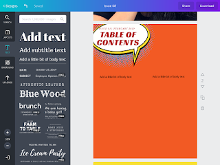
So with my photos and all, I just have some trouble with deciding the fonts and how I am going to lay out the table of contents, but I am really happy with the colors I have chosen. Like I said in all my previous posts, I wanted this magazine to embody different. So every page is a different shade of warm tones, plus yellow is such a bright color that catches people’s attention in a positive way. As well as the little add ons of the comic effect or icons, embody being different and daring! Here are some sneak pics!


No comments:
Post a Comment